 BACK
BACK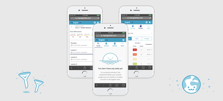
My English Lab
My English Lab is Pearson's largest English language learning site, using a blended learning model whereby students and teachers have access to both physical books and accompanying online experiences, accessible either in-class or at home.
My Role
UX Lead
Key Skills
Design Strategy, UX, Research, Agile Product Delivery
Case study
The brief
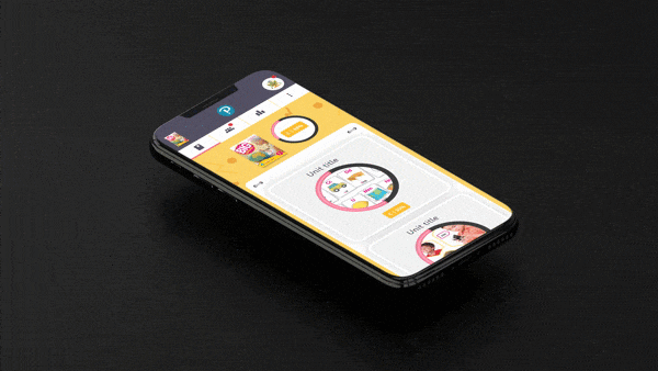
To design an 'on the go' mobile experience for students learning english around the world.
The reduction in cost of smartphones over the years has seen a resulting surge in the number of students who now have regular access to their own mobile device.
Globally we've seen an increase in students turning to their mobile devices to learn, where convenience and portability meet to open up new learning opportunities.
With over 1.4 million yearly active users learning on the legacy desktop platform, a considered data-led approach to the mobile transition was paramount.
Process and workflow
Improving working relationships globally
One of my first tasks when joining the project was to evaluate the existing working relationships between the various teams and geographic locations.
Prior to me joining the team, design resource and influence had been transitioning (without great success) from Poland to the Global Product UX team in London.
The initial brief and problem was clear. I needed to find ways to improve the way that UX was working with other parts of the business and to build new working foundations across the teams.
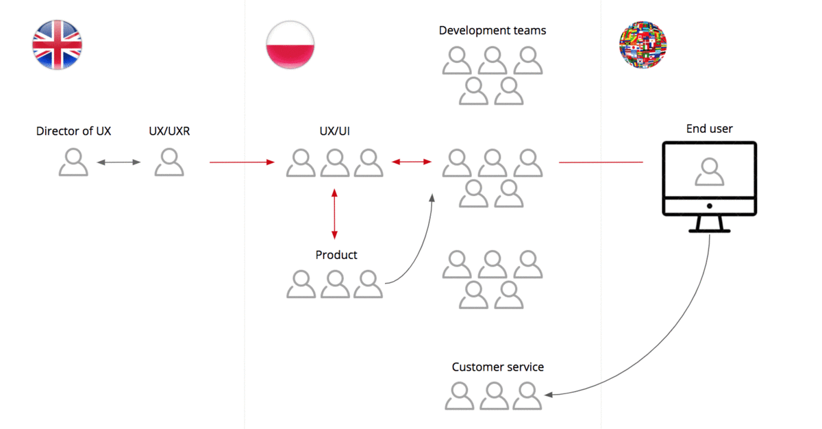
Current VS new workflow
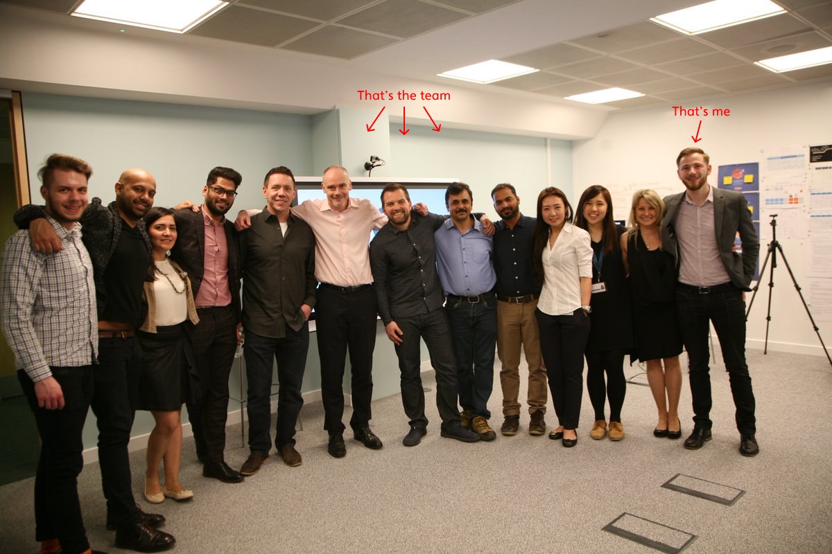
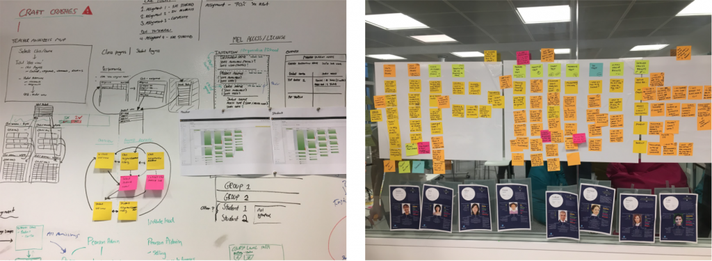
Within just a few weeks of joining the project, myself and the lead researcher on the project flew to Poland to run 3 days of workshops. The aim – to speak to and get to know the various project teams (product/dev/customer services/analytics etc) and to pitch a new and improved workflow.
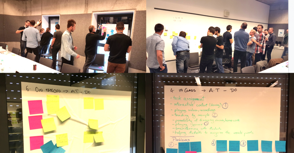
UX engagement workshops with development teams in Poland
UX and SAFe (Scaled Agile Framework)
Part of the reason a new workflow was needed was to react to a change in Agile methodology. SAFe (Scaled agile framework) was introduced in place of SCRUM agile. This meant tailoring the design process to accommodate 10 week delivery cycles, known as program increments (PI).
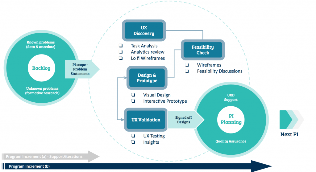
Proposed and agreed design and delivery workflow
A waterfall(esque) approach may seem a bit backwards nowadays, but given the complex global research required for this project, 10 week delivery cycles gave us the time needed to tackle large and complex epics, ensuring that time was allocated to gathering global requirements and validating solutions across multiple geographies.
Discover & Understand
The architecture of a legacy product…
One of the first challenges that I faced in this project was to deal with a problem that had been slowly spiralling out of control for quite some time. A legacy product that had been growing in functionality for 6 years – feature by feature – without a great deal of consideration for the impact of the overall architecture.
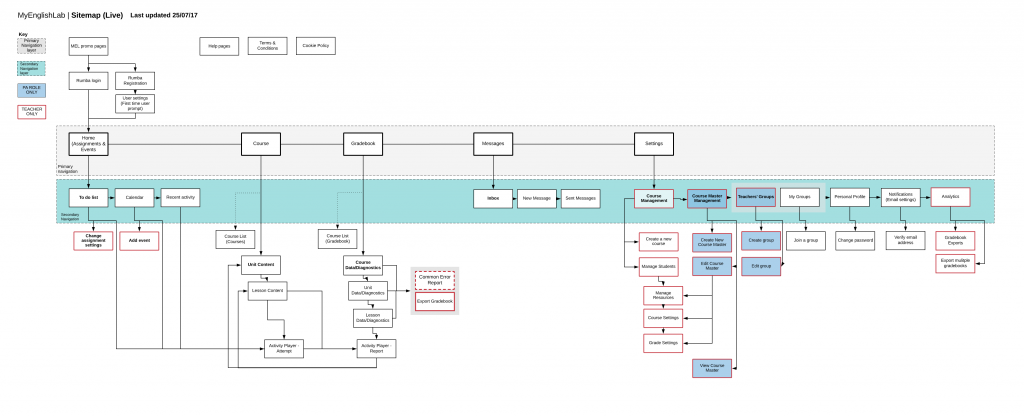
Legacy platform sitemap
After mapping the current architecture of the legacy platform I was able to understand the breadth of the platform, the relationship between functionalities and the routes that teachers/students were taking. Mapping out the above sitemap served as a starting point to work from when considering a simplified and targeted architecture for the mobile experience.
Delivering value
Cramming EVERYTHING from the legacy platform into a mobile experience would have certainly been the worst thing to do. So we did the opposite. We (myself and the lead researcher) wiped the slate clean and opted to reach out to students across the world to determine WHAT features students needed when learning 'on the go', WHY there was value in these, and to help the product owner prioritise WHEN to release.
Working closely with the Lead researcher we sent out a survey through the platform to over 1000 teachers and students to find out what features our users value most and how often/how likely they were to use certain features on their mobile device. This gave me a list of 4 or 5 key features that would help form a value driven MVP for a mobile product.
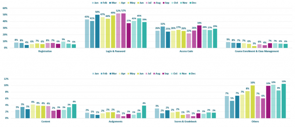
Customer services complaints categories
On top of using the QUANT data from the survey to understand and identify potential value in learning 'on the go', I also worked closely with the Customer Services team to expose what wasn't working so well on the legacy desktop experience.
As clunky and difficult as legacy platforms can be, when you combine the age of the platform itself and all the data it holds, it's the history of the 'legacy' that allows the designer to really understand what users wants/doesn't want.
A combination of in-platform feedback and analytics reports were collated, translated and thematically grouped; providing a great amount of QUANT and QUAL insights to reference throughout the design process.
As well as making the most of historical data, I also made the most of past work completed by my predecessors. The year prior to the project a worldwide Persona project had been completed, with UX researchers travelling the world to interview students (of various ages), teachers and parents and produce a healthy set of Personas to design for.
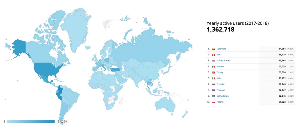
Google analytics demographics stats 2017/2018
As you can see in the Google Analytics map report above, there was no hiding how global the platform was. Working in the global product team within Pearson, it was standard practice to consider and design for global audiences. This included conducting both QUANT and QUAL research across the core markets.
Explore & Define
Wireframes
After collating and analysing all of our insights, I began to explore drawing out a vision for the mobile experience in wireframe format – focusing on the core functionalities highlighted from the global survey and customer feedback. At this point, I also brought in support from a UX content writer to support with content strategy and copywriting.
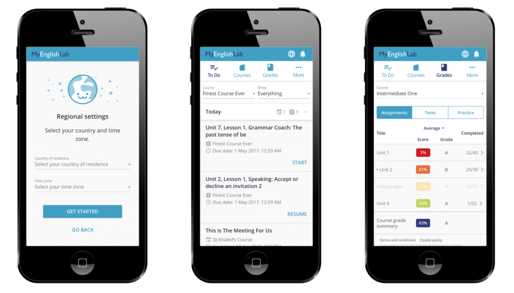
One design decision to note was the approach to navigation. A hamburger menu would not best support the ability for students to quickly toggle between views. A bottom navigation bar (popular in native applications) would become troublesome with mobile web browser bars pushing floating elements (such as a bottom navigation bar) up and down, causing difficulty in actually finding a consistent tap area for the navigation items! In response, I opted for a top navigation bar showing the top valued tools/functionalities (as identified in the research) and ensured that those were made accessible to students.
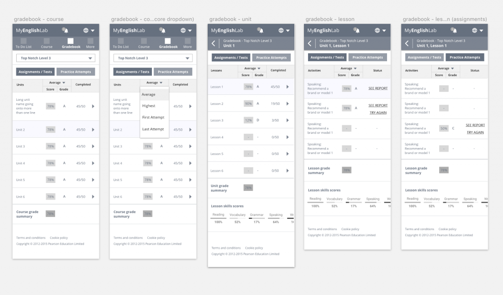
Mobile gradebook wireframes
As mentioned above, I paid close attention to data coming in from the legacy desktop platform when designing the new mobile experience. One notable (yet small) issue that I addressed was relating to irregular data input. The business highlighted to me that an unusual amount of users had input their country of residence as Afghanistan – despite not having a large user base actually residing in Afghanistan.
After reviewing the existing form design and anticipating the behaviour of a student in a rush to skip what they deem to be superfluous steps in a journey; it was clear that a combination of a standard drop down field listing over 190 countries (in alphabetical order) and large proportion of lackadaisical teenagers, resulted in students selecting the first item on the list. Which in this case, was Afghanistan. A simple UX issue that had caused quite a mess in the database.
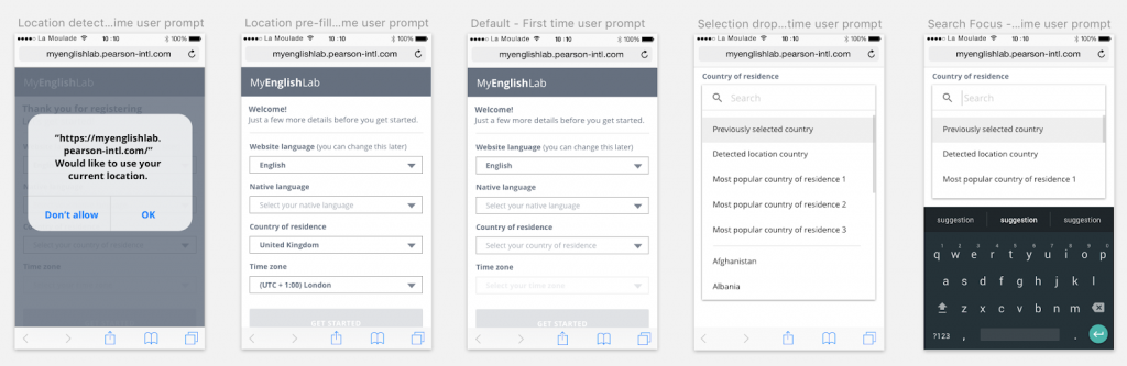
Additional data capture wireframes
In the mobile experience, I addressed this issue by using browser location detection to pre-empt the country of residence, appended the most common countries to the top of the list and added the ability to type to search.
UI Designs
I worked closely with a UI designer based in Poland so I kept wireframes strictly functional, stripping all colour and styling out, focusing on the user flows and interaction design.
UI design examples
Working with the UI designer, I was focused on ensuring that the new mobile experience was engaging enough for our audience. As part of that, I worked with the UI designer to introduce engaging illustrations along with a variety of micro interactions and animations throughout the experience.
Develop & Test
Prototyping
As a matter of course, I like to build prototypes (high or low fidelity) throughout the design process. I believe prototypes serve a greater purpose than being a tool solely for testing purposes. Prototyping often identifies gaps in the designs and can be the best way for myself as a designer to ensure the experience is as considered as possible. Not only this but I have found prototypes to be invaluable in the delivery phase for developers to reference or even just to inspire or engage stakeholders throughout the process.
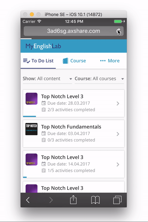
Interactive prototype used for testing
I built a fully functional prototype within Axure, infused with micro interactions and animations. The ultimate intention was for this prototype to be used in usability testing sessions, and was therefore also designed and built to support a research script – written in collaboration with the lead researcher.
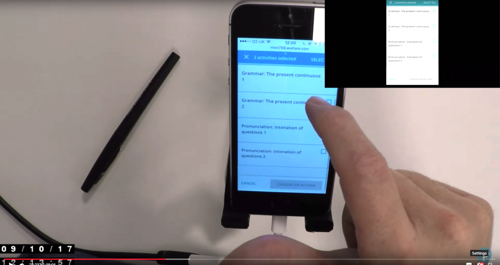
Usability testing
I worked closely with the lead researcher to produce recruitment screeners, topic maps, discussion guides and test scripts for research sessions.
Usability tests were conducted both in person in Pearson's state of the art usability lab and remotely for participants in other key geographies. Myself and the lead researcher alternated between observing the sessions and facilitating them.
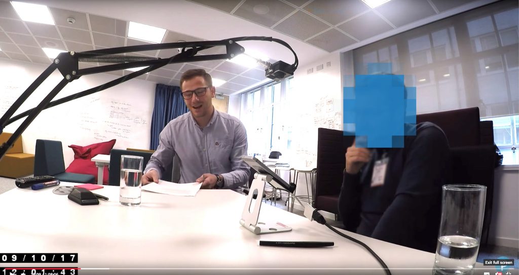
Myself conducting usability testing sessions
Mr.Tappy live streaming sessions to YouTube
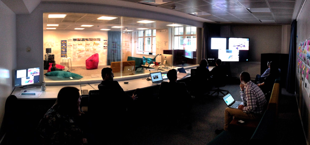
Observation room in London User Experience Lab
Following the usability study, myself and the project team discussed and collated the findings and prioritised any issues found. The insights from the study were then used to iterate the designs.
In the case of already developed or in-progress features, I worked directly with the Product Owner to prioritise the fixes and plan these into the development roadmap.
Deliver & Listen
PI Planning
As illustrated in the design and delivery process, we were delivering in line with the SAFe agile methodology. This meant that every 10 weeks we were delivering batches of designs to the developers in Poland.
Every 10 weeks I flew out to Poland to run the team's quarterly Agile planning presentations, representing design by presenting work to a large, globally-distributed team of engineers and product managers. I managed to build up some good experience speaking into a microphone to a very large group of people!
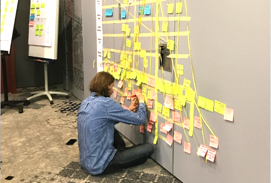
PI planning work board and dependency mapping in Poland
The PI planning sessions were a great opportunity to sit down and get right into the detail of the designs with the developers, answering any questions and designing in situ where necessary.
I continued to work in these design and delivery cycles until the mobile experience reached a release state. Prior to release, I had worked with the analytics team to set up metrics that I wanted to measure once launched.
The results
3 months after the launch of the new student mobile experience, I dived into Google Analytics to evaluate and measure any impact for the 1+ million users across the world – what has worked well and what hasn't.
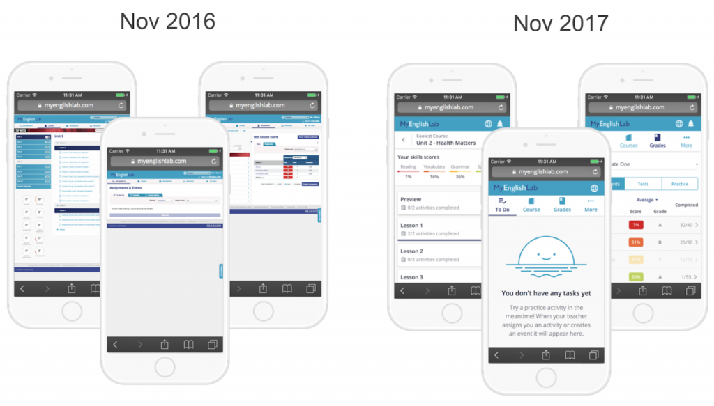
The old vs the new mobile experience
When comparing the analytics data from the previous year, the key success metrics had evidently shifted in a very positive direction:
Bounce rate
– 66%
Activity completion
+ 77%
New visitors
+ 35%
Returning visitors
+ 54%
To go into detail on just one of those metrics, the new experience saw an increase of 77% of activities completed on a mobile device. That stat alone gave an insight into the the number of students who felt more comfortable completing activities on their mobile compared to the previous year. Then combining that with the high reduction in bounce rate and increase in returning users, we were also able to get an idea of how sticky the new experience was and how well catered the mobile experience was for the growing mobile market.
The project was showcased as an example of success within the company. My analytics reports and results were escalated high up the business and commended highly.
As a designer I feel a great sense of satisfaction knowing my work had a positive impact on such a large global user base. Helping students to learn english can unlock a variety of opportunities in people's lives, where speaking english is vital for them to progress in their education, employment or social/family lives. Playing my part as an enabler to this was a privilege and leaves me full of pride.
More work