Pearson | Young learners
"If you can't explain it to a six year old, you don't understand it yourself."
Albert Einstein
My Role
UX Lead
Led UX efforts across K-12 english language teaching and learning products, specializing in designing experiences for young learners and teachers around the world. Projects ranged from designing LMS (Learning management systems) for web, to native app experiences, to interactive whiteboard experiences.
The brief
To produce specialised and tailored experiences to excite and motivate young learners in their english language learning journey.
Over the years the competition in children's digital learning products has been growing, with the quality of consumer grade products being of an incredibly high standard.
Pearson's objective is to provide 'lifelong learning', meaning that learners can interact with Pearson's products from the point they first enter the education system all the way through to adult life. A great opportunity therefore to form a great first impression by building bespoke products for children.
Having worked on various learning experiences for the secondary/adult market, designing for learners as young as 3 would be a completely different challenge…
Discovery
Collaborative Design
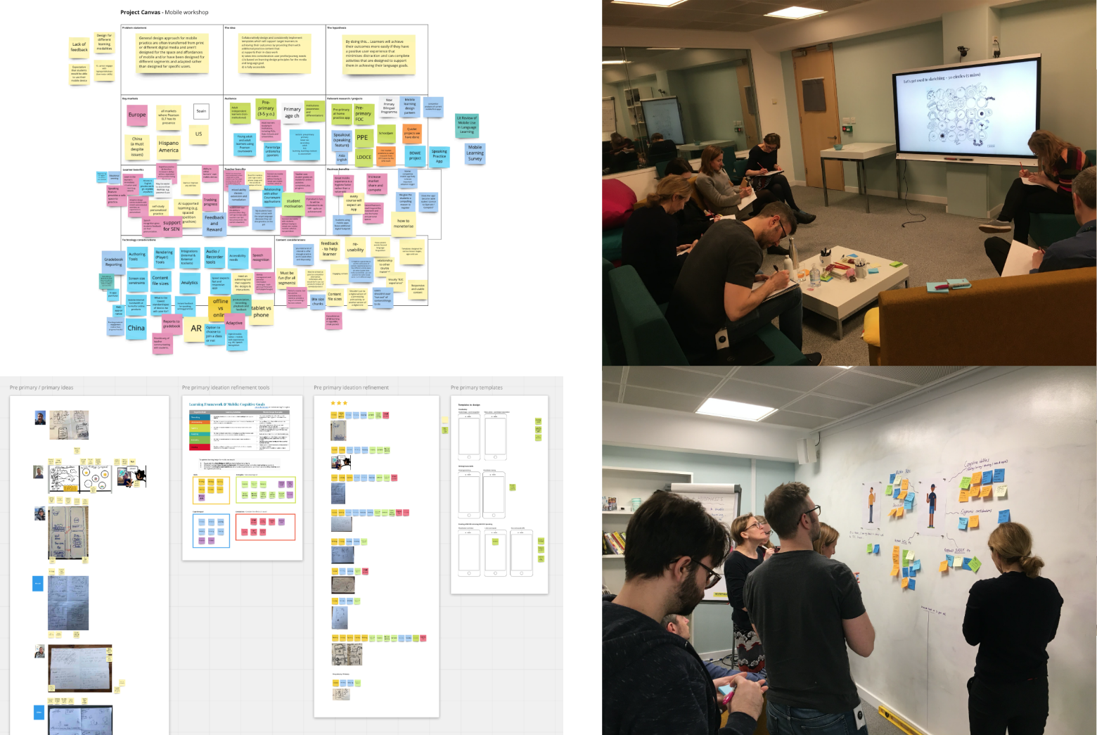
Leveraging the wealth of industry expertise and knowledge within Pearson, I led and ran a series of workshops with a variety of stakeholders during the discovery phase of the initiative. These sessions included project canvas sessions, ideation sessions and empathy mapping sessions both in person and virtually.
Research
Understanding Motivations
In order to design for children it was crucial to understand their motivations. Without addressing what motivates and engages children, it would be unlikely that any digital product would be able to hold their attention.
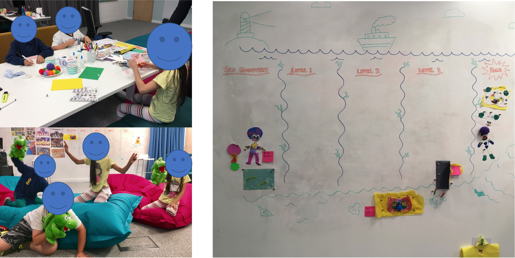
Pearson study – Motivation & progress
Referencing a past study conducted by our team in our London Lab we were able to gain a better understanding on motivations and attitudes towards 'progress'. The study involved asking children to create their own avatar and create a story as their character progressed through 'levels'.
As you can see, the designs for the avatars were highly creative and the children had a great deal of fun creating them, which seemed to play an important role in engaging them throughout the rest of the activities. The study highlighted the importance of extrinsic motivation, rewards & recognition and freedom to play.
Market Analysis
As standard practice a thorough exploration into the current market was conducted. Depending on the age the products were targeting, there were consistencies between the use of colour, animation, sound and text.
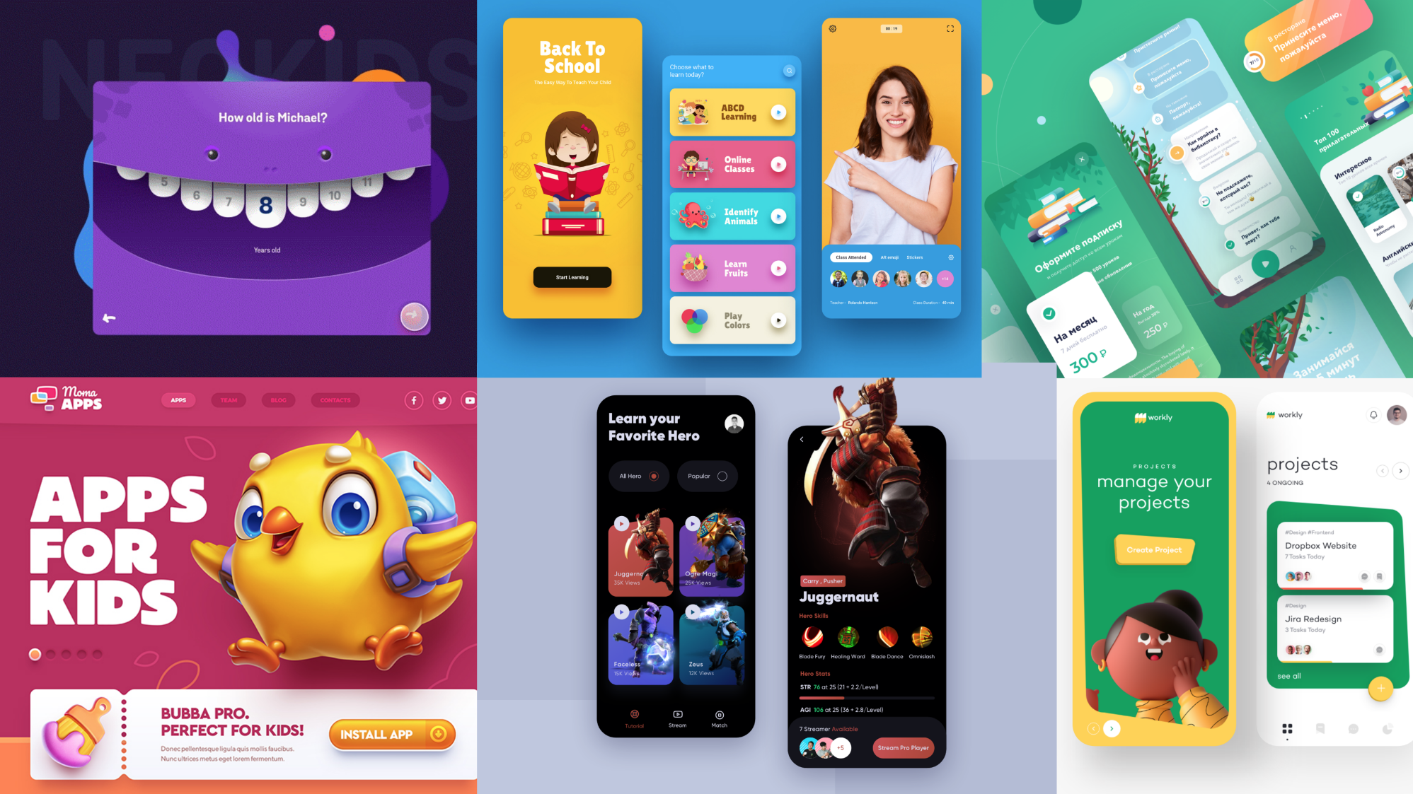
Competitor analysis – childrens digital products
One thing was for sure, that was that if Pearson was to compete in the D2C space the products were going to need to be of an equally high standard.
Colour Theory
Whilst COVID was in full flight and we had VERY limited access to conduct research, I conducted an in depth desk study looking into colour theory for a global young audience.
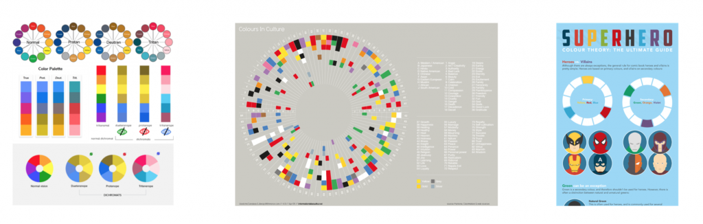
Colour theory research – Colour Blindness | Cultural perceptions of colours | Child colour theory
As Pearson's products reach a truly global audience and understanding of perception of colour globally was vital. A really fascinating topic, highlighting what colours to use to safely across the globe to convey the appropriate emotion.
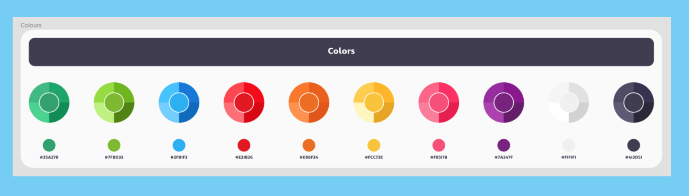
In particular the colour YELLOW seemed to evoke the feeling of joy and fun across most geographies, a key emotion that would need to be utilised for a child's product don't you think! On top of this yellow (and blue) were one of the few colours that are able to maintain their colouring for most colourblind conditions.
Keeping the child engaged was a key focus for this initiative and was flagged as high priority. The colour yellow is universally understood as a colour marking 'warning', just think what colour the 'danger wet floor' signs are in the supermarket. This is because yellow is in fact one of the easiest colours to see as our eyes are naturally sensitive to it.
After these findings, I pushed for a yellow primary colour to be explored so that when needed we could have the best chance possible to capture the attention of the child whilst using our digital products.
Interaction & sound design
Child first interaction patterns
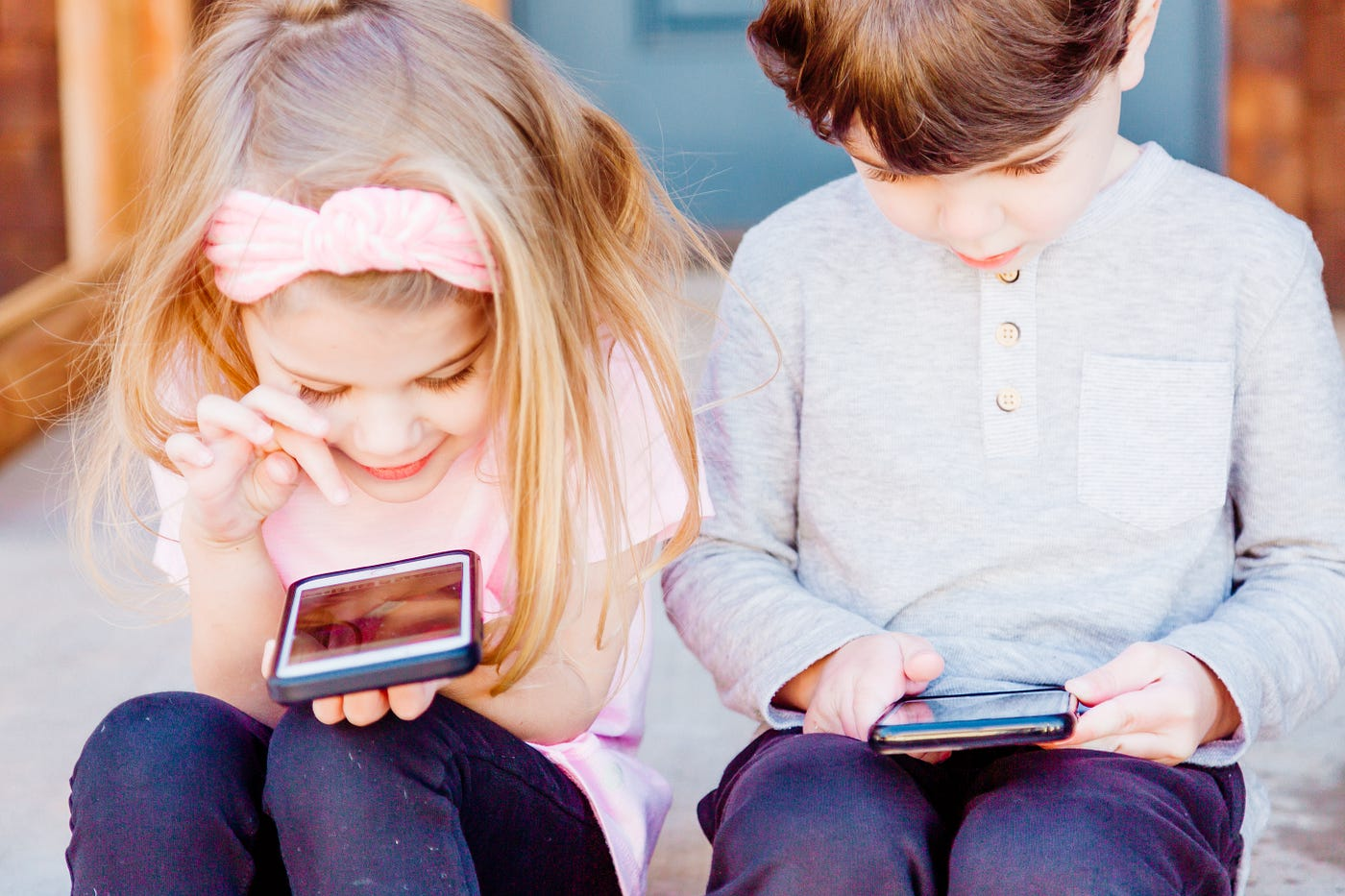
Interesting to note, throughout the market analysis and desk research I noted the quantity of products that were ONLY supporting mobile.
The reason for this is actually something that was already picked up in the empathy and persona sessions conducted earlier. Limited dexterity and motor functions in younger children means that ergonomically a mobile phone is an easier device to interact with than a conventional keyboard and mouse. Simple tap and swipe gestures are interactions that can be understood from a very young age, where as the fine tuned click, scroll and move of a mouse is a much harder interaction to get to grips with.
From an interaction design standpoint it was clear that any interactions throughout the digital experiences needed to be as simple as possible. Even actions such as typing on a default keypad vs a custom keypad could be the difference between a product that works or doesn't work.
UI Sound Design
This was something that I personally pushed for and led within the team. No previous products had utilised UI Sound before so this was a new area to explore.
Sound to most fully grown adults on app/websites is something that should be used with care and in moderation, always at the control of the user. For childrens products however, it's a powerful tool that can be used to convey a variety of messages and you shouldn't be afraid to utilise it. Sound can be especially important for children who can't yet read or aren't even looking at the screen!
It was time for me to step out of my adult shoes for this one given the absence of sound in most adult digital experiences. For those of you who have experienced sitting on a train next to a child on their parents phone, you will probably have noticed that they have a tendency to want the volume up and always on. Well, kids don't seem to mind at all.
I ran a collaborative sound design workshop with the design team, where I asked the team to complete a series of tasks to get people used to thinking of the meaning of UI sounds, the ways of describing them and the potential uses in our applications.
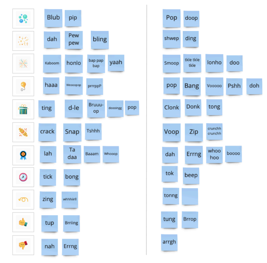
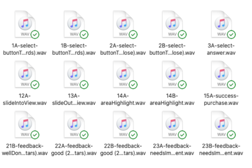
Sound design workshop output alongside the final assets
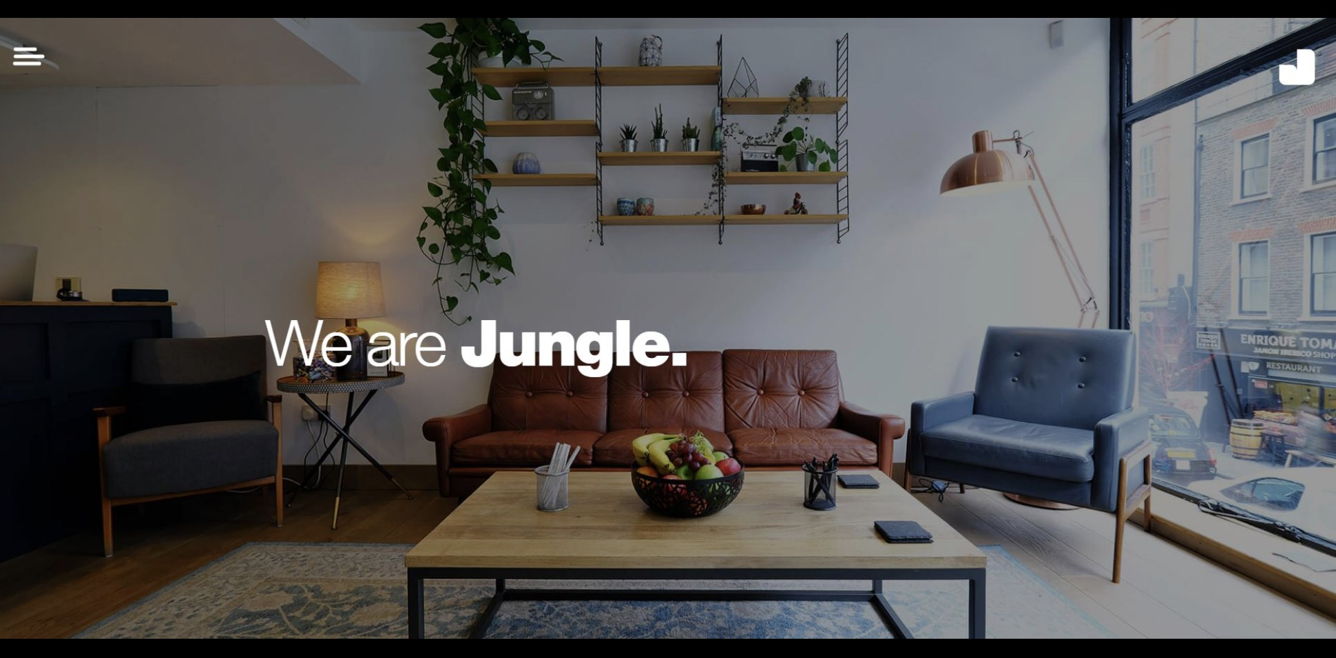
Following this I engaged with a sound design studio in Soho – Jungle Studio. Working closely with the sound producer, we produced a pack of bespoke UI sound files to use in our childrens digital products.
At home experiences
App Wireframes
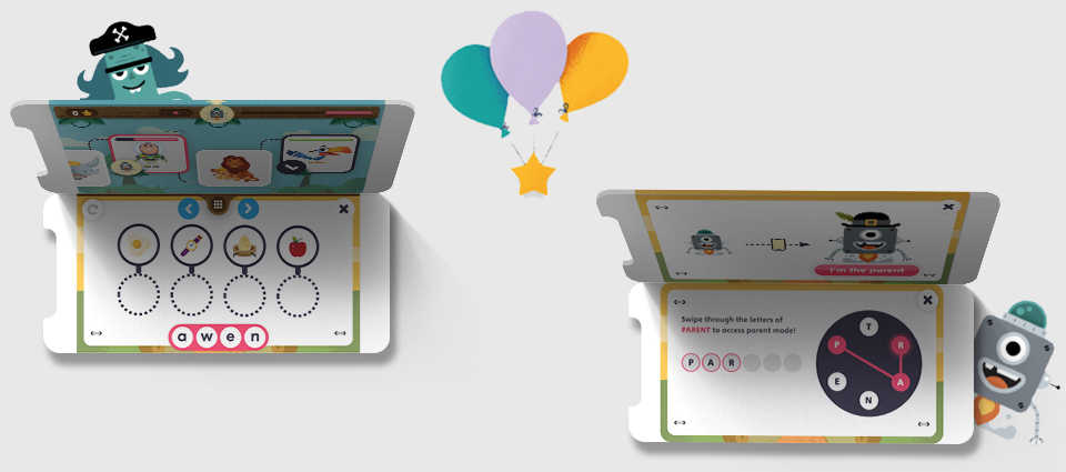
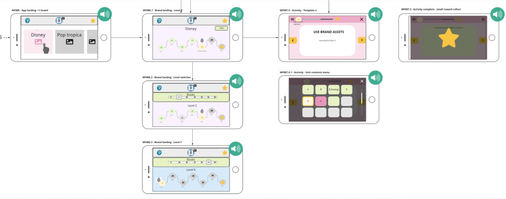
The first product to put all the research and findings into practice was an english practice app targeted towards 3-5 year olds.
Working closely with various stakeholders across the business I produced a set of wireframes and flows illustrating the key components and interactions.
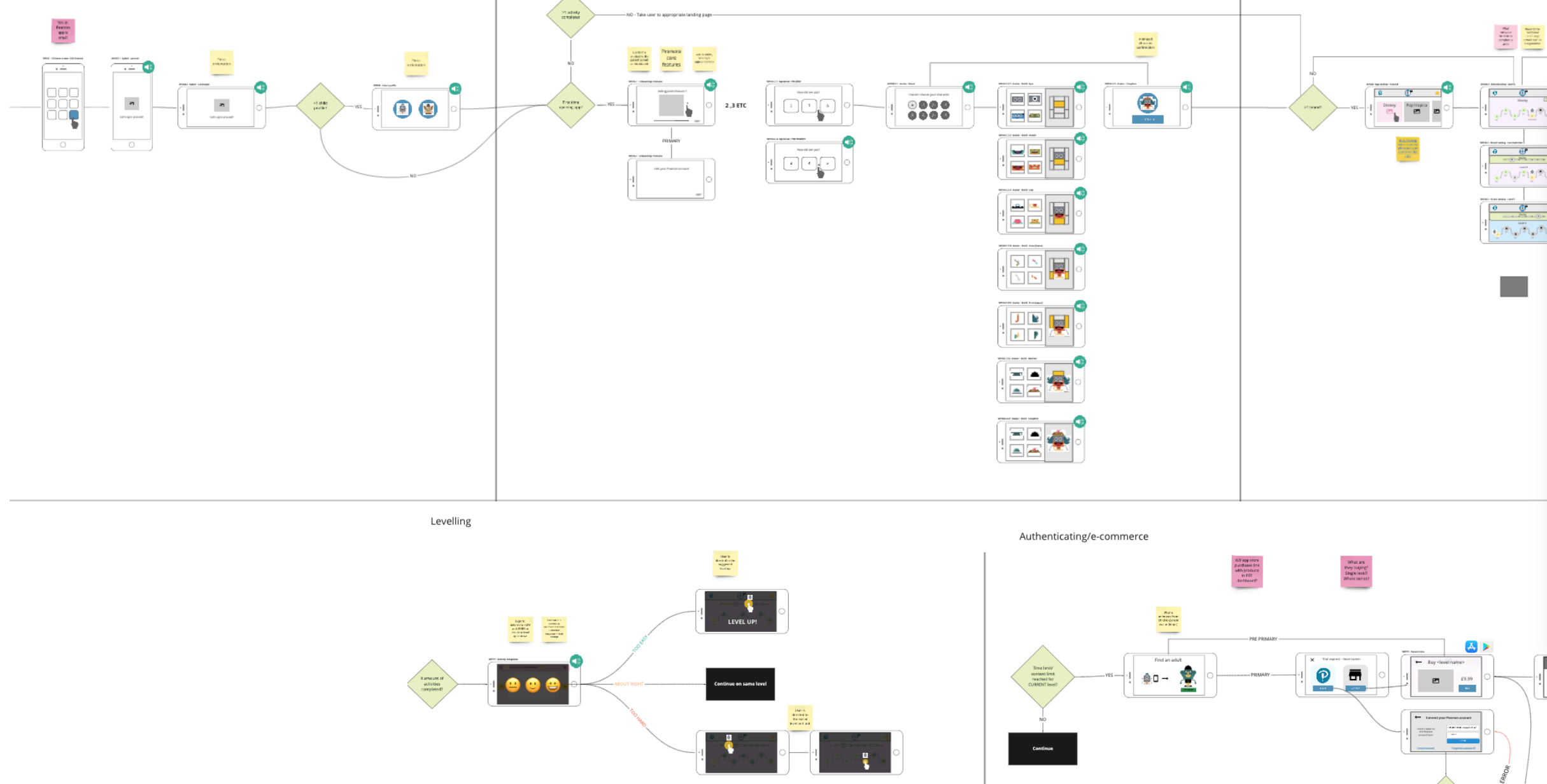
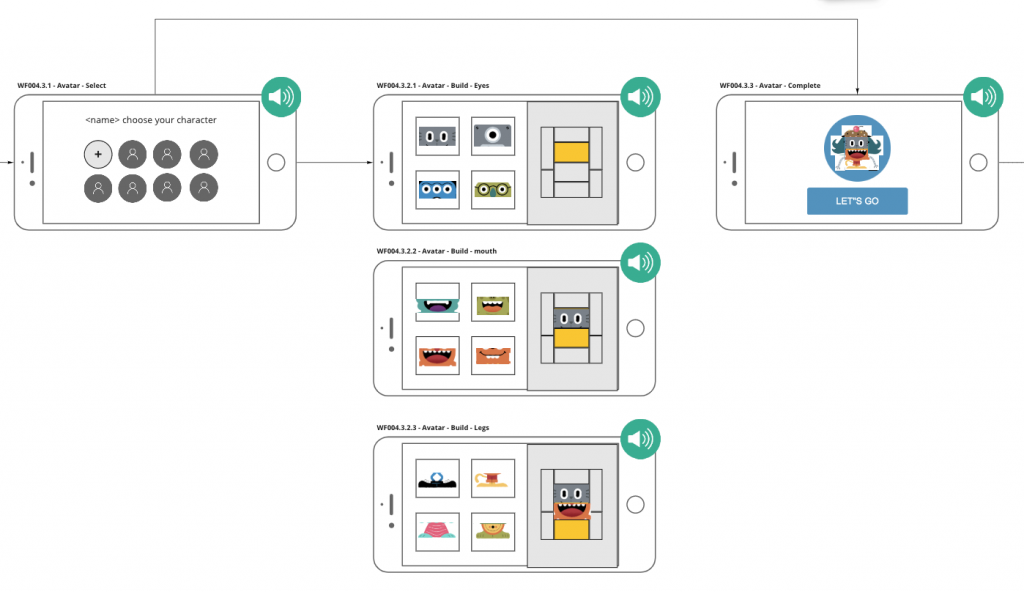
Experience Wireflows
One feature to note that fed in from the research study was to allow the children to create their own avatars to act as their identifiers (as well as in the future their way of logging in). This would allow the user to have their avatar follow them through the experience and also acts as a handy way to distinguish between accounts where multiple children use the same phone.
The experience was intentionally designed to allow the child to be able to 'self serve' and complete the user on-boarding without the need for their parents assistance. The same goes for navigating through the content, the design intentionally avoided the use of complex interactions, abstract imagery/iconography and where ever possible remove as much text as possible. For children that are 3 years old and not native english speakers, reading english on an app would be a tough task.
Forced landscape wireframes for improved ergonomics
There were instances however that required us (the application) to be able to gain access to the parent. I therefore designed an animated 'interrupt' that would visibly describe to the child to hand their phone to their parent.
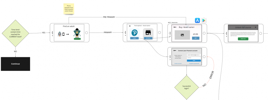
'Safe zones' for targeted parental interactions
Child friendly authentication system
Configurable Avatar Builder
I worked closely with the lead UI designer to outsource illustration work to an illustrator to help design a set of configurable avatar 'body parts'. Following from the research study we wanted to allow the child to be as creative as they wanted when creating their avatar. Further avatar personalisations/upgrades were also considered as part of the gamification model which was future scope.
Along with a set of pre-set avatars the user would be able to create their own using the designed 'avatar builder'.
Avatar builder system
The avatar system actually fed into a wider initiative looking into innovative ways to help students log in. One of the biggest complaints cases we were seeing were from teachers complaining that students could never (or never wanted to) remember their passwords.
Together with a few of the UX team we jointly worked on an avatar based authentication system that would allow students to create an avatar and then sign in by building it again (with a few extra auth questions).
This is especially important for our young learners would would not have the cognitive or dexterous skills to type in a password let along remember one.
Video recording of Canada schools web based authentication system
Above is a video recording of a high fidelity prototype that I built to be used in usability testing in schools in Canada.
This design pattern is actually filed as a US design and technical patent (so no copying!).
UI Design
I worked closely with a very talented UI designer who was able to bring the designs to life, taking all of the UX insights and research on board.
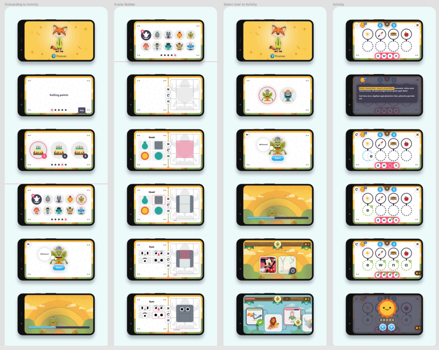
English Practice App UI
Prototyping & Animating
With the first draft of UI designs completed I began to start building a high fidelity and high functionality prototype. This prototype served 2 main purposes:
1. To showcase to the rest of the business the new young learner design initiate.
2. To be a functional enough prototype that we could look to run usability tests with children (as if it was the real thing).
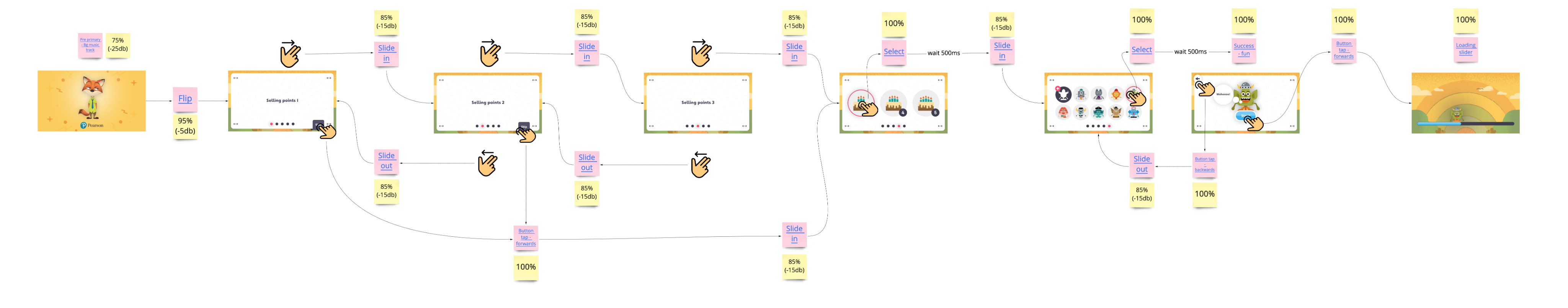
I built the prototype in Axure, the only tool capable of allowing such complex functionality, 'hacked' sound integration and animation support.
Visualising specifications
I then supplied separate specifications to show how all screens were linked together along with the different gestures, direct link to sound files and animations.
In-Class experiences
No two classrooms are the same.
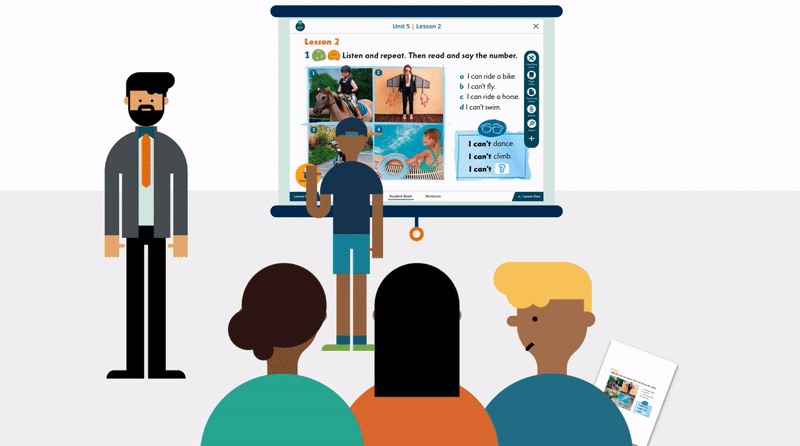
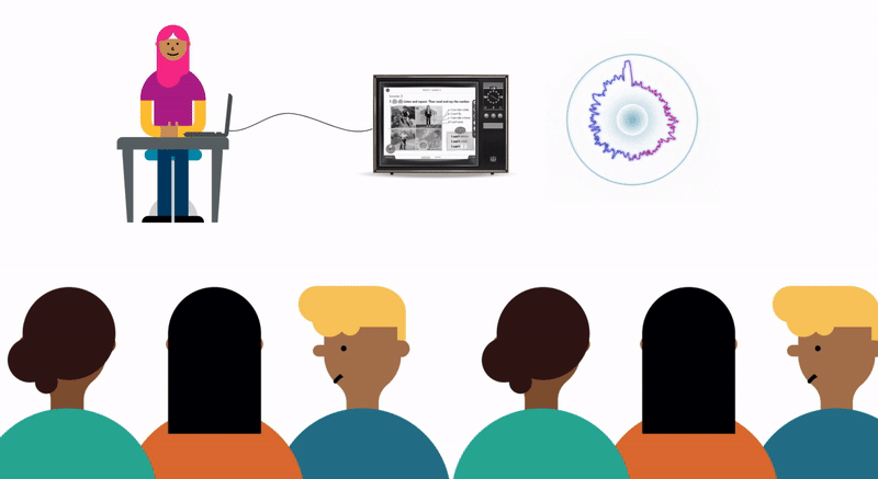
Another project that I was leading in parallel was an in-class teaching tool, used either on static screens, projectors or interactive whiteboards.
Not all classrooms are made equal. Across the world access to technology within schools varies a huge amount, some having interactive whiteboards in every room, others with just a small black and white tv screen on a trolley.
This meant that careful thought was needed to ensure the optimal experience across such different devices and environments.
Some well funded schools had high tech interactive whiteboards or projectors
Other schools (the like one I spoke to in Vietnam) teachers used to bring their own CRT tv to school to teach their students
From an interaction design standpoint, careful thought was needed to ensure that the presentation product would support both touch gestures as well as keyboard and mouse.
Ergonomics and environmental considerations
As part of the young learner design initiative I led a project that aimed to produce a new interactive in class experience for 3-5 year olds.
On top of everything that was considered for the mobile app, an in-class experience required further thought.
Ergonomics were really important when designing for both fully grown adult teachers and 'tiny humans' and allowing them both to interact with the whiteboard in harmony.
I reviewed reports and imagery from school visits in China where this product would mainly be marketed. As you can see, the children are mostly standing and would really struggle to reach high up on the board. The opposite is for the teachers, who may struggle to reach the bottom of the board with any comfort.
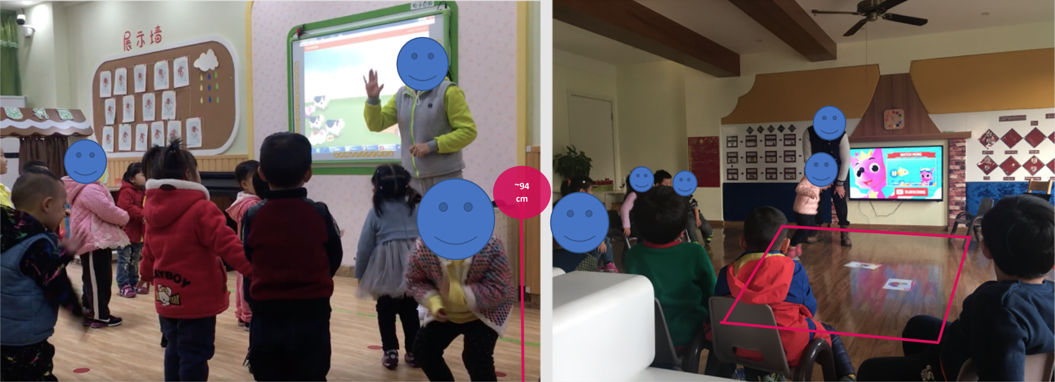
Imagery from team China school visit
The average height of a 3 year old is about 94-95cm, which if you have a meter ruler to hand is surprisingly low down to the ground! I needed to therefore consider the touch zones for children of this height to give them the best chance to interact with the screen.
Another consideration when designing an in class experience is the use of space AROUND the screen. For pre-primary or primary classes it's common for students to play games / complete physical activities around the screen – dancing and singing to a song for example.
With a distinct lack of support for multi-touch devices, activities need to be engaging enough for not only the child touching the screen but also those who are standing around it.
Interactive Whiteboard Usability Study
I designed and ran an interactive whiteboard study in our London usability lab to better understand the way that teachers interact with whiteboards in the class room. My primary focus was to observe gestures used throughout a set of scripted tasks as well as observing what they did physically in the room (where they stood, where they positioned moveable objects etc).
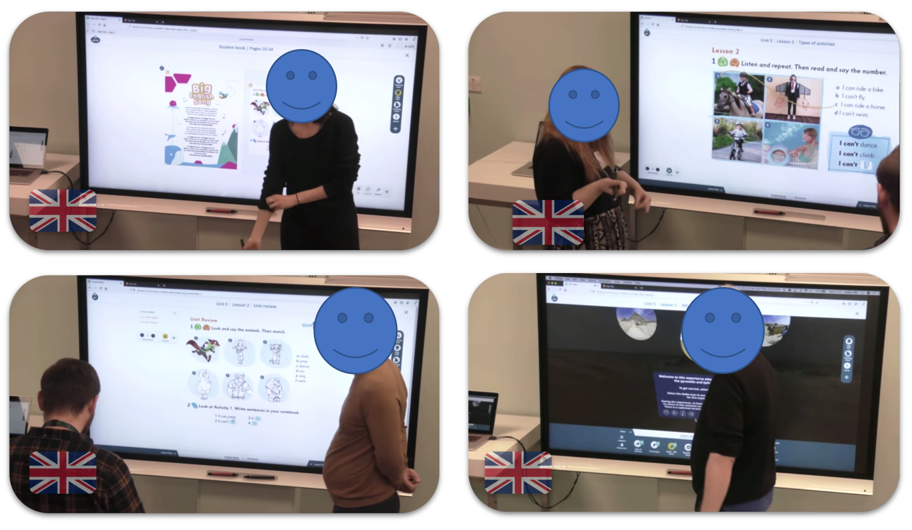
Usability study I planned and facilitated in the UK
In order to observe 'as real as possible' behaviour I built a high fidelity and high functionality interactive prototype that would work on either an interactive whiteboard or on a laptop (for the remote sessions I also ran in Poland and Spain).
I was not just testing the interactions, but also testing a new concept for a new activity player that was due to be rolled out globally.
Password: Password1
Wireframes
The design approach was quite a simple one. Separating teacher controls with student controls I could try to ensure that both adults and children were able to reach their appropriate controls.
One major advantage and consideration to this approach was also to give some security that the students 'may' not be able to reach the important teacher controls at the top and potentially disrupt the lesson. Our knowledge of children in a classroom suggested that children would be eager to play and press any button (irrespective of the consequence!)
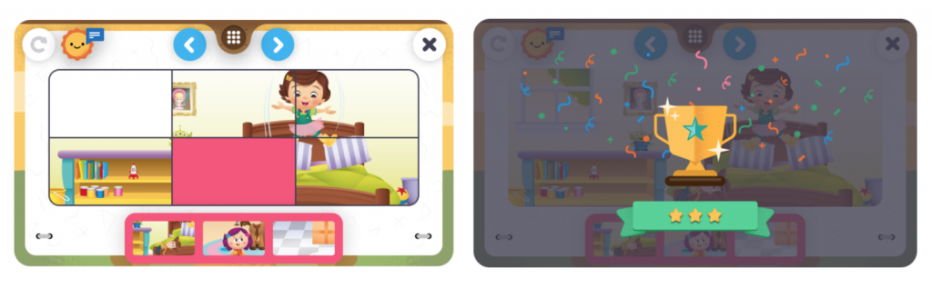
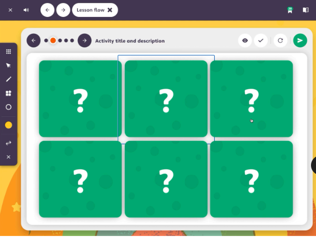
I took this concept and built a set of flexible activity templates, working closely with learning designers and efficacy consultants.
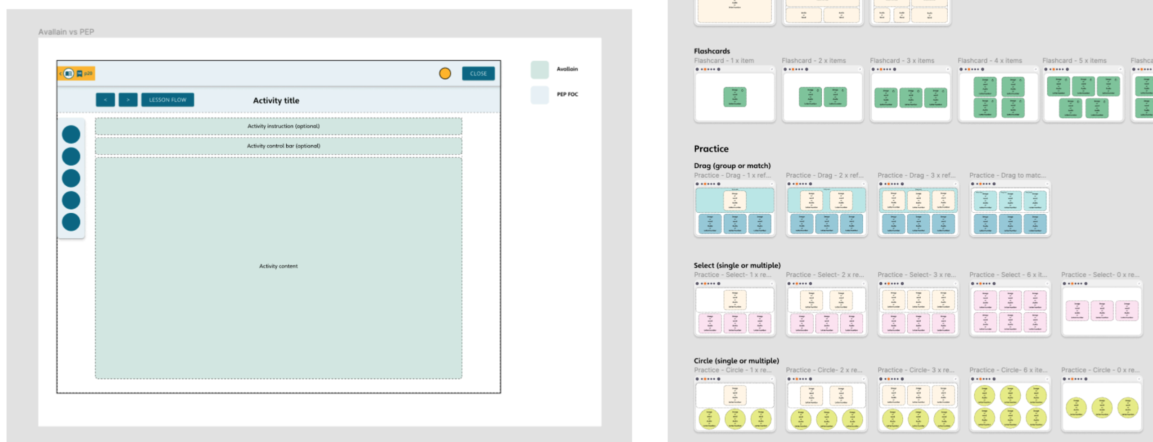
Working with the content production team, the templates were designed in a way to be as flexible as possible. In the past the content team had struggled with rigid templates, so hopefully the new flexible approach would help with creating a wider range of activities along with improving the longevity of this specific player.
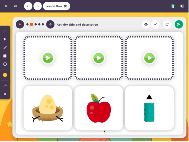
Prototyping & UI
Utilising the young learner design kit that we had established for the app, I worked closely with the UI designer to turn these templates into the high fidelity designs.
Once the UI was established I once again began prototyping and establishing the sound and animation design.
In addition to using the prototype as a method of handing over fine tuned sound/animation requirements to the developers, as with the app it was intended that once we could gain access to schools (once COVID and school term time allowed) this would be tested in-class with both teachers and students.
Kids first design approach
After all of this work designing for children, paying close attention and care to ensure they are given the best opportunity to succeed in using the digital product, it really made me think why the experiences for teenagers and adults needed to be so complicated.
I was leading a web project which was targeting children, teenagers and adults – all within a single application layer.
There was a distinct lack of thought or support for the young learners on the platform as the tool was originally designed for adults. To be frank, it just didn't work for kids and was also uninspiring for adults.
Following this work I proposed a new architecture and design vision to re-design the experience both 'mobile first' and now 'kids first'.
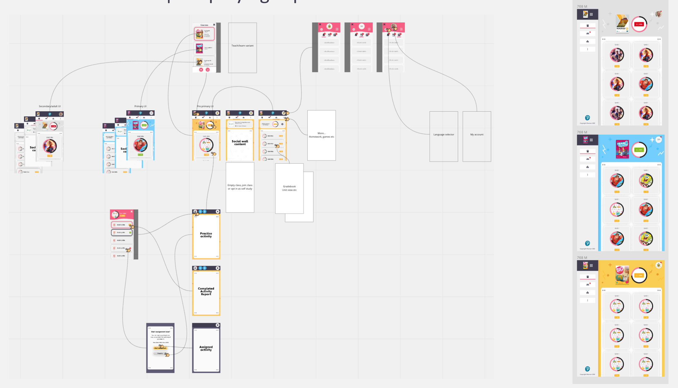
Stripping back the interactions, simplifying the navigation, removing text wherever possible and using themes and content to visually distinguish the age groups — helped to form a single solution that could work for all.
In conclusion
I found this work to be extremely interesting and rewarding. Designing for children isn't as simple as 'making it fun' or 'making it colourful', there's so much depth and thought that needs to go into the design in order to get the response that is intended.
Following these projects, when I'm designing I now ask myself 'would this work for a child?'. As a designer looking to design the simplest and most effective experiences, it's a pretty good question to ask yourself.